Understanding the Secrets Behind Store Imagery: How Visuals Influence Grocery Choices
Visuals are the silent salespeople in every supermarket aisle. This guide explains how grocery store layout, visual merchandising and shopping psychology combine to shape buying decisions — and gives practical how-to steps for shoppers, store managers and local supermarket marketers.
Introduction: Why imagery matters more than you think
Every color, display and product angle in a supermarket is deliberate. Retailers invest in visual merchandising because, across categories, a well-executed store environment increases basket size, impulse buys and loyalty. If you're a shopper, understanding these cues helps you save money and avoid unplanned purchases. If you're a local supermarket manager, these tactics are tools to improve conversions and customer satisfaction.
For managers looking to modernize visuals and digital integration, read our in-depth analysis of building your brand after eCommerce restructures in food retailing; it covers the operational changes needed to make visual merchandising work with online ordering.
Consumer insight tools are now powerful enough to read sentiment and behavior — a capability explored in consumer sentiment analysis for market insights. These tools inform which visuals convert locally and which do not.
How grocery store layout guides decisions
The grid: Efficiency meets predictability
Most supermarkets use a grid layout: parallel aisles that make inventory easy to stock and customers predict where categories are. The predictability lowers cognitive load, which encourages shoppers to stroll longer and add items. Grids work well in large stores focused on grocery essentials and weekly shops.
The racetrack/loop: Forcing discovery
Supermarkets that want to maximize exposure use a racetrack layout — a perimeter path that leads shoppers past high-margin departments (produce, bakery, deli). The loop increases the chance of impulse buys because customers encounter more categories on a single trip.
Free-form and destination layouts
Smaller or boutique markets rely on free-form layouts that encourage browsing. Destination layouts strategically place tempting departments (fresh coffee bar, prepared foods) to create anchor points that keep shoppers in the store longer. If you're experimenting with in-store pop-ups or limited-time offers, see lessons from experiential activations like the Gisou honey butter bar pop-up for ideas on creating memorable visual moments.
Visual merchandising tactics that move products
Endcaps and focal points
Endcaps are premium real estate. They turn mid-aisle products into destination items and often increase sales 3–5x for featured SKUs. Use bold signage, stacked facings and cross-merchandising (pair chips with salsa, cereal with milk) to increase relevance. For help finding deals you can leverage for endcap promotions, check our deals primer on finding the best sugar product deals, which shows how featured promotions can drive volume.
Signage, color and typography
Color cues (green for fresh, blue for frozen) and typography hierarchy guide the eye. Contrast triggers attention: a bright price sticker on a muted shelf will pop. Typography must be legible at a distance — shoppers make split-second decisions. When testing signage, pair it with digital messaging online so promotions are consistent across channels.
Lighting, sightlines and product facings
Lighting creates perceived freshness. Directional lights on produce or bakery cases increase perceived quality. Product facings (how many items face the front) are a low-cost way to signal abundance; three facings look fuller than one. Combine lighting with well-planned sightlines to lead customers toward high-margin or overstocked items.
Psychology: How visuals trigger buying decisions
Scarcity and urgency cues
Limited-time signage and low-stock alerts (real or perceived) trigger urgency. When a product is presented as scarce — "last chance", "limited edition" — shoppers accelerate their decision-making. Use scarcity carefully to avoid customer distrust or perceived manipulation.
Anchoring and price perception
Anchoring places a high-priced item next to a mid-priced option so the latter seems like a bargain. Visual displays can anchor perception: a premium olive oil on a pedestal next to standard bottles shifts how the standard is judged. For product lines like beauty or health, align visual anchors with promotional messaging seen in channels like our beauty deals guide.
Cross-sensory cues and storytelling
Products that tell a story sell better. Imagery that shows origin (farm photos), process (baking in-store) or sustainability can command price premiums. Cross-sensory merchandising — pairing visuals with smell (fresh bread) or sound (ambient market music) — strengthens memory and repeat purchase.
Local supermarkets: Applying visual tactics for community relevance
Local-first imagery and trust
Customers are increasingly local-minded. Use imagery that highlights local suppliers, community events, and neighborhood staff profiles to build trust. Local relationships are a competitive advantage, as discussed in our piece on building local relationships while traveling — the same principles apply to neighborhood retail.
Event spaces and pop-ups
Short-term activations—pop-ups or tasting stations—create news and foot traffic. The concept behind pop-up activations is similar to the experiential projects studied in building community through travel. Use them to test new layouts or to launch seasonally relevant visuals with measurable outcomes.
Hyperlocal offers and signage
Tailor visuals to local preferences — plant-forward displays in neighborhoods with health-focused shoppers, or family-style recipes near suburban stores. Integrate deal messaging with our local deals coverage — for example, leverage grocery promotions to support community-centric visual campaigns like sustainable cereal choices in eco-aware neighborhoods (eco-friendly cereal choices).
Digital and in-store imagery: Bridging online and physical
Visual consistency across channels
Customers expect the same imagery online and in-store. If an online product image shows a full loaf of bread but the store shelf only has a few slices left, conversion and trust suffer. Integrating visual guidelines across channels reduces friction and increases loyalty.
Use of data and AI to optimize displays
AI-driven consumer sentiment tools can recommend which imagery converts best for specific zip codes. For guidance on using sentiment analysis to inform merchandising choices, see consumer sentiment analysis. These tools help iterate signage and promotional creatives faster than traditional A/B tests.
Operational reliability: APIs, POS and imagery sync
Visual strategies depend on back-end reliability. When APIs or POS integrations fail, online inventory images and in-store stock can fall out of sync. Our technical primer on understanding API downtime explains the operational steps to mitigate these risks and keep imagery accurate during peak sales windows.
Category-specific visual strategies
Produce and perishables
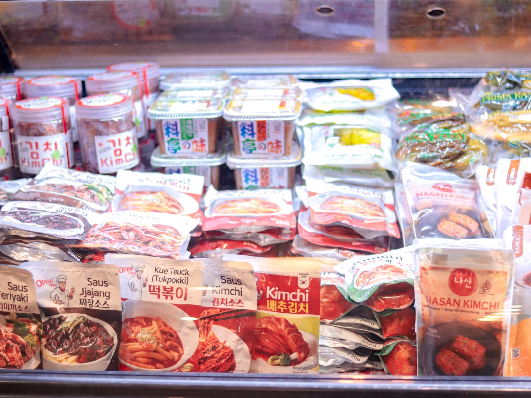
Fresh produce relies on color, abundance and seasonal storytelling. A bountiful display with visible variety signals quality and freshness. Rotate displays to showcase seasonal items and local farms to tell a credible story.
Dairy, freezer and staples
Staples sell on convenience and clarity. Use clean, consistent labeling and shelf talkers. In frozen and refrigerated areas, strong lighting and large photographic product shots on the outer case doors improve recall — and can reduce shopper search time.
Health, beauty and pharmacy
Health and beauty categories use aspirational imagery and authoritative cues (doctor endorsements, ingredient callouts). Learn how membership models change pharmacy buying and messaging in the rise of online pharmacy memberships; visual communication must align with membership promises and savings.
Design for small formats and micro-stores
Maximizing impact in limited space
Small-format stores must be highly curated. Prioritize facings, modular shelving and vertical merchandising to display more in less space. Principles from small interior design can apply; see techniques for small rooms in maximizing small spaces for transferable layout ideas.
Localized assortments and cross-merchandising
Curate assortments based on local shopping behavior and use cross-merchandising as the primary discovery tool. Feature local ready-to-eat items near checkout for high-margin convenience purchases.
Community and sustainability signals
Small-format stores can win by signaling sustainability and local sourcing with strong visuals. Highlight eco-friendly certifications and sustainable cereal or snack options — our eco cereal piece offers category examples to promote (eco-friendly cereal choices).
How shoppers fight back: A shopper's how-to guide
Create a sighted shopping list
Make a visual list: categorize items and take a photo or use an app. Visual lists reduce impulse buys by helping you focus on intent. If you shop for specific deals, our sweet savings guide shows how to combine promotions and avoid overspending (sweet savings).
Use store imagery to validate quality
Look beyond packaging: inspect lighting, freshness cues and signage credibility. If a store showcases local claims, verify with labels or ask staff; community-focused stores often have better provenance information — similar to principles in local relationship building.
Leverage online research while in-store
Scan barcodes or use your phone to check reviews and ingredient lists. For product categories with frequent reformulation (bodycare ingredients, allergens), consult resources like our bodycare ingredient primer (crucial bodycare ingredients).
Measuring visual impact: metrics and testing
Key performance indicators (KPIs)
Track conversion per display, dwell time, basket size, units per transaction and repeat purchase rate. Use short A/B tests across similar stores to isolate visual changes. Pair sales lift with customer feedback to measure perceived value.
Experiment frameworks
Run controlled visual experiments: keep price and promotion constant, change only the visual treatment (lighting, signage, facings). Use a minimum 4-week test period to smooth weekly shopping cycles and seasonal effects.
Case study approach
Document before-and-after images, traffic patterns and POS data. For digital tie-ins, include API reliability checks so real-time availability matches imagery — see lessons in API downtime for operational safeguards.
Pro Tip: An endcap that pairs a promotional SKU with a complementary category increases total basket spend by up to 25%. Document the pair, light it well, and test a signage variant with and without urgency language.
Comparison: Common visual tactics and when to use them
The table below compares five visual tactics across objectives and when each is most effective for local supermarkets.
| Tactic | Primary Objective | Best Used For | Cost / Complexity | Expected Impact |
|---|---|---|---|---|
| Endcaps | Immediate lift | Promotions, new SKUs | Low–Medium | High (short-term sales spike) |
| In-aisle signage | Navigation & education | Category differentiation | Low | Medium |
| Product theatre / sampling | Experience & trial | New foods, prepared meals | Medium–High | High (trial converts to repeat) |
| Ambient cues (lighting / scent) | Perceived quality | Fresh departments (bakery, produce) | Medium | Medium–High |
| Digital screens | Dynamic messaging | Time-sensitive promotions | High (tech & content) | Variable (depends on content) |
Special topics: Sustainability, memberships and operations
Sustainability in visual merchandising
Visuals that show sustainability credentials — recyclable packaging icons, local sourcing stories — resonate with eco-conscious shoppers. For category examples, review sustainable cereal movement coverage to see how messaging can be used to command preference (eco-friendly cereal choices).
Membership models and exclusive visuals
Membership programs use exclusive visual cues (member-only pricing tags, member shelves) to encourage signups. If you're evaluating pharmacy or healthcare memberships for your store, our overview of online pharmacy memberships highlights how visuals should reinforce perceived savings and access (online pharmacy memberships).
Operational tips for reliable visual execution
Execution is everything. Train store teams on planogram compliance, image standards, lighting maintenance and timely restocking. Operational reliability prevents the credibility gap between promise and reality; this mirrors the service reliability steps recommended in technology operations pieces like API downtime lessons.
Implementation checklist for store teams
30-day visual sprint
Week 1: Audit current displays and capture photos. Week 2: Create hypotheses and quick mockups. Week 3: Roll out 2–3 tests. Week 4: Measure KPIs and iterate. Use simple A/B logic: change one visual variable at a time.
Tools and talent
Equip teams with a visual standards playbook, simple image editing tools, and a calendar that aligns visual events with promotions. Consider cross-training staff on experiential activations inspired by travel and community-building case studies (building community through travel).
Partnering with suppliers
Work with suppliers for co-funded displays and merchandising materials. Share local sentiment data with vendors to drive tailored visual campaigns; these cooperative models are common in categories where suppliers want rapid consumer adoption, similar to promotional strategies discussed in retailer brand case studies (building your brand).
Conclusion: Visuals as a strategic lever
Visual merchandising and store layout are not decorations — they are measurable drivers of shopper behavior. Whether you run a local supermarket or are an engaged shopper, understanding and applying these tactics leads to better decisions: higher sales and happier customers for retailers, and smarter spending for consumers.
For small-store design inspiration and compact layout tricks, explore small-space design techniques you can repurpose for retail. To align in-store visuals with digital promises, build resilience into your systems using best practices for uptime and integration discussed in API downtime lessons.
If you want to test a visual program in your store, start small, measure quickly and iterate. For inspiration on experiential displays and community-built activations, see how travel and pop-ups drive engagement in these case studies: Gisou pop-up insights and community travel lessons.
Want help implementing a 30-day visual sprint or connecting visuals to your online storefront? Contact your local retail specialist or consult our operational guides on building brand and eCommerce structure in retail (building your brand).
FAQ
Q1: How much does visual merchandising cost for a small supermarket?
A1: Costs vary by scope. Small changes (new signage, rearranged facings) can be under a few hundred dollars. Modular lighting or digital screens are larger investments. Start with low-cost experiments and scale effective treatments.
Q2: How long before I see results from changing store imagery?
A2: Short-term uplifts can appear within days for impulse-focused tactics (endcaps), but reliable results usually take 2–4 weeks to control for shopping cadence and inventory cycles.
Q3: Are visual tactics ethical if they nudge shoppers into buying more?
A3: Ethical merchandising prioritizes transparency and value. Use visuals to highlight genuine savings, quality and provenance. Misleading cues can damage long-term trust.
Q4: Can visuals reduce perceived price sensitivity?
A4: Yes. High-quality imagery, stories of origin and experiential cues can make customers less price-sensitive and more likely to choose premium options.
Q5: How do I align visuals with sustainability goals?
A5: Use truthful certifications, display packaging lifecycle info and highlight local suppliers. Promote sustainable SKUs with clear signage and seasonally relevant storytelling; see examples in our sustainability coverage for product categories (eco-friendly cereal choices).